

Summarify.me
Summarify.me
AI Based summary generator.
AI Based summary generator.
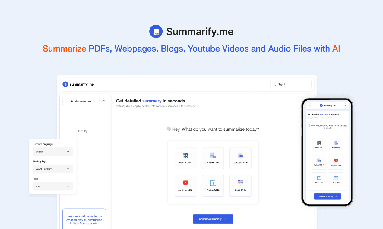
Summarify, developed by 1811 Labs, is a cutting-edge AI application designed to streamline the way users consume information. In an era of information overload, Summarify offers a solution by efficiently condensing extensive articles and documents into concise, easily digestible summaries. This innovative product not only saves users valuable time but also provides them with essential insights.
Summarify, developed by 1811 Labs, is a cutting-edge AI application designed to streamline the way users consume information. In an era of information overload, Summarify offers a solution by efficiently condensing extensive articles and documents into concise, easily digestible summaries. This innovative product not only saves users valuable time but also provides them with essential insights.
Tools
Figma
Figma
Services
Visual Design
UX Design
Visual Design
UX Design
Industry
Artificial Intelligence
Artificial Intelligence
Date
October 2023
October 2023

My contribution
My contribution
My role as a designer
My role as a designer
As the designer, I played a crucial role in this fast-paced and flexible design process. My job involved coming up with ideas, building prototypes, and refining the design through iterations. The goal was to craft a website that not only looked good but also prioritized the needs of users. This required delving into human behavior patterns to ensure the best possible user experience.
As the designer, I played a crucial role in this fast-paced and flexible design process. My job involved coming up with ideas, building prototypes, and refining the design through iterations. The goal was to craft a website that not only looked good but also prioritized the needs of users. This required delving into human behavior patterns to ensure the best possible user experience.

How Might We
How Might We
Problem Overview
Problem Overview
In a world flooded with information, everyday users, like Sarah, are drowning in content. Whether it's news articles, blog posts, websites, or research papers, the struggle to quickly understand and retain key points is real. Summarify steps in as the application, offering a user-friendly solution to effortlessly distill the essence of any document, making information consumption a breeze for everyone.
In a world flooded with information, everyday users, like Sarah, are drowning in content. Whether it's news articles, blog posts, websites, or research papers, the struggle to quickly understand and retain key points is real. Summarify steps in as the application, offering a user-friendly solution to effortlessly distill the essence of any document, making information consumption a breeze for everyone.

Defining the goals
Defining the goals
Problem Objectives
Problem Objectives
The Summarify website design project was guided by the following key objectives:
🌐 Website Design: Develop a captivating and user-centric website that effectively communicates Summarify's core value proposition.
🤝 Human-Centric Design: Ground the user interface in behavioral patterns to enhance user engagement and ease of interaction.
🚀 Agile Development: Adopt an agile approach to swiftly transform the project into a live website, aligning with the rapid pace characteristic of a micro project.
📈 Traffic Diversion: One pivotal objective was to seamlessly guide users toward 1811 Labs' flagship product, Audionotes, thus increasing traffic to this major project.

Research & Explanation
Research & Explanation
Discover Phase: Understanding the User Behavior
Discover Phase: Understanding the User Behavior
In the Discover phase, my mission was to understand how people interact with AI applications. I delved deep into this testing out ai applications, aiming to understand insights that would inform my design decisions and enhance the Summarify experience.
By studying how users behaved, we gained a clearer picture of their needs and preferences. This understanding formed the foundation for making Summarify more user-friendly and aligned with their expectations.
Research was basically secondary which included two methods I did follow to gain insights:
Market Research and Competitive Analysis
I scrutinized the AI application and content consumption platform market to identify trends and opportunities for Summarify.This helped me to build insights around user behaviour.
Design Trends and Data
I remained current with design trends, especially in AI-related websites, to ensure a contemporary and visually appealing design. Data-driven decisions steered my design choices.For example we went from simple side navbar layout to more compact bento based layout.
The two goals for the research were:
The two goals for the research were:
🌐 Understanding Behavior Patterns: We delved into how people use AI tools, learning about their likes, challenges, and how they navigate through interactions.By closely observing their preferences, identifying pain points, and studying the ebb and flow of their interactions, we gained valuable insights. This understanding became the cornerstone for crafting a more intuitive and user-centric Summarify.
🌐 Understanding Behavior Patterns: We delved into how people use AI tools, learning about their likes, challenges, and how they navigate through interactions.By closely observing their preferences, identifying pain points, and studying the ebb and flow of their interactions, we gained valuable insights. This understanding became the cornerstone for crafting a more intuitive and user-centric Summarify.
🌐 Jacob's Law of Web Usability: In shaping our design philosophy, we tapped into the wisdom of Jacob's Law of Web Usability. This foundational principle highlights the significance of familiarity in design. We embraced this guiding principle, tailoring Summarify to align with users' past experiences, thereby reducing cognitive load effectively.
🌐 Jacob's Law of Web Usability: In shaping our design philosophy, we tapped into the wisdom of Jacob's Law of Web Usability. This foundational principle highlights the significance of familiarity in design. We embraced this guiding principle, tailoring Summarify to align with users' past experiences, thereby reducing cognitive load effectively.
RESEARCH INSIGHTS
002
Users prefer AI applications that provide concise and accurate summaries of content.
Users crave AI apps to swiftly summarize lengthy content
Users appreciate customization for summary length and detail
Building trust is crucial; users rely on accurate and reliable AI applications
Users value AI apps handling various content types
Discover Phase
OCT 23


Research & Explanation
Research & Explanation
Design Phase: Understanding the User Behavior
Design Phase: Understanding the User Behavior
As I started designing Summarify's website, my main goal was to make it simple and efficient while prioritizing the user. I created a process for quick projects, where I quickly turned ideas into designs using Figma. The important steps in this process included planning the user's journey, creating a moodboard to capture the right look and feel, and making careful choices about fonts and colors.
This approach allowed for a flexible and iterative process, where the evolving design of Summarify's website combined aesthetics with functionality. The process found a balance, ensuring quick project completion without sacrificing the user-centered design principles that create a meaningful digital experience.
User Flow Development: Navigating from Brief to Features
Starting with a comprehensive feature list derived from the project brief, the first step was mapping out the user flow. This involved charting the user's journey through the application, ensuring a logical and intuitive progression. This early blueprint laid the foundation for a user-centric design.
Moodboard Creation: Capturing Simplicity and Clarity
A curated moodboard emerged as a visual compass, capturing the essence of Summarify's identity. Focused on simplicity and clarity, the moodboard guided decisions on aesthetics, ensuring that the design resonated with the target audience while aligning with the product's core values.
Type and Color Selection: Shaping the Visual Identity
With the user flow and moodboard as guiding lights, attention turned to the selection of type and color elements. Typography was chosen for readability, and a color palette was crafted to evoke the desired emotions. This step was pivotal in shaping Summarify's visual identity.

Evolution of the Summarify Home Screen
001
TYPOGRAPHY AND COLOR PALETTE
003
Helvetica Neue—
IS OUR
PRIMARY FONT.
_ a clean and contemporary choice,
for modern simplicity
( bold )
( medium )
( regular )
TYPE SCALE
Opting for a type scale between 10 to 24 px for web screens enhances readability and creates an appealing design, optimizing the user experience.
24px
1.714rem
summarify.me
20px
1.429rem
summarify.me
18px
1.214rem
summarify.me
14px
1.000rem
summarify.me
12px
0.857rem
summarify.me
10px
0.714rem
summarify.me
#355BE1
Royal Blue
( PRIMARY COLOR)
#FF4D00
Vermilion
( SECONDARY COLOR )
#EBEFFC
Lavender
( PRESSED COLOR STATE )
#212121
Black
( NEUTRAL DARK )
#FAFAFA
White Shade
( NEUTRAL LIGHT )
#EAEAEA
Grey
( STROKE COLOR )
As a designer, I chose Blue to create a sense of trust and familiarity with technology, which aligns with what users expect. I chose Orange to add energy without being distracting.
Neutrals were intentionally used as a background to prioritize easy reading of content and create a calm user experience.
Design Phase
OCT 23

TYPOGRAPHY AND COLOR PALETTE
001
Helvetica Neue—
IS OUR
PRIMARY FONT.
_ a clean and contemporary choice,
for modern simplicity
( bold )
( medium )
( regular )
TYPE SCALE
Opting for a type scale between 10 to 24 px for web screens enhances readability and creates an appealing design, optimizing the user experience.
24px
1.714rem
summarify.me
20px
1.429rem
summarify.me
18px
1.214rem
summarify.me
14px
1.000rem
summarify.me
12px
0.857rem
summarify.me
10px
0.714rem
summarify.me
#355BE1
Royal Blue
( PRIMARY COLOR)
#FF4D00
Vermilion
( SECONDARY COLOR )
#EBEFFC
Lavender
( PRESSED COLOR STATE )
#212121
Black
( NEUTRAL DARK )
#FAFAFA
White Shade
( NEUTRAL LIGHT )
#EAEAEA
Grey
( STROKE COLOR )
As a designer, I chose Blue to create a sense of trust and familiarity with technology, which aligns with what users expect. I chose Orange to add energy without being distracting.
Neutrals were intentionally used as a background to prioritize easy reading of content and create a calm user experience.
Design Phase
OCT 23

Homepage
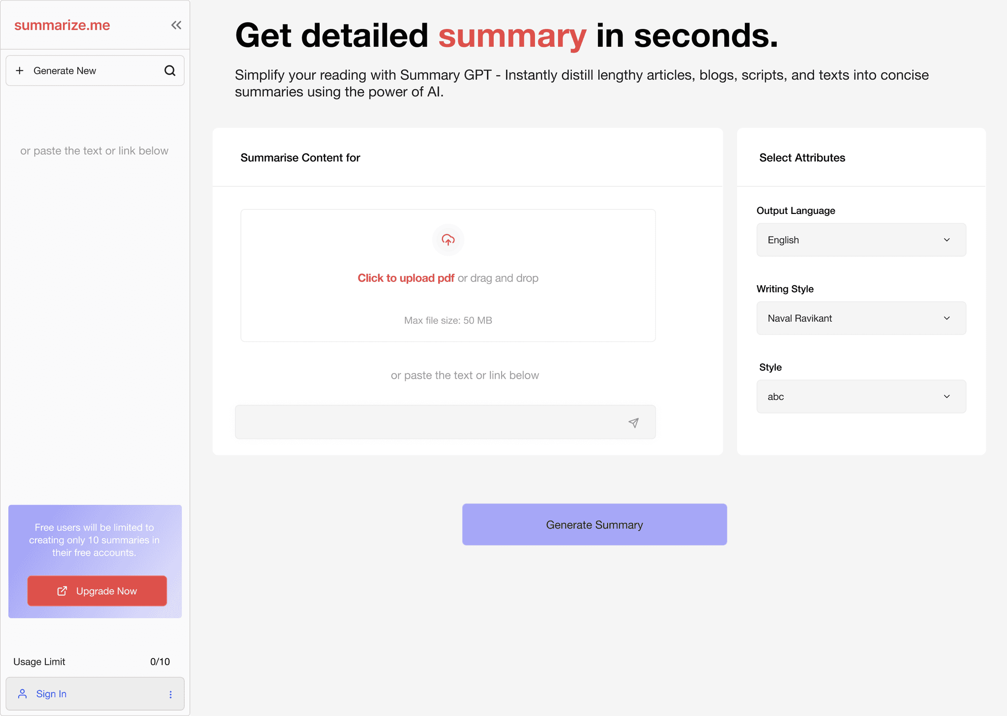
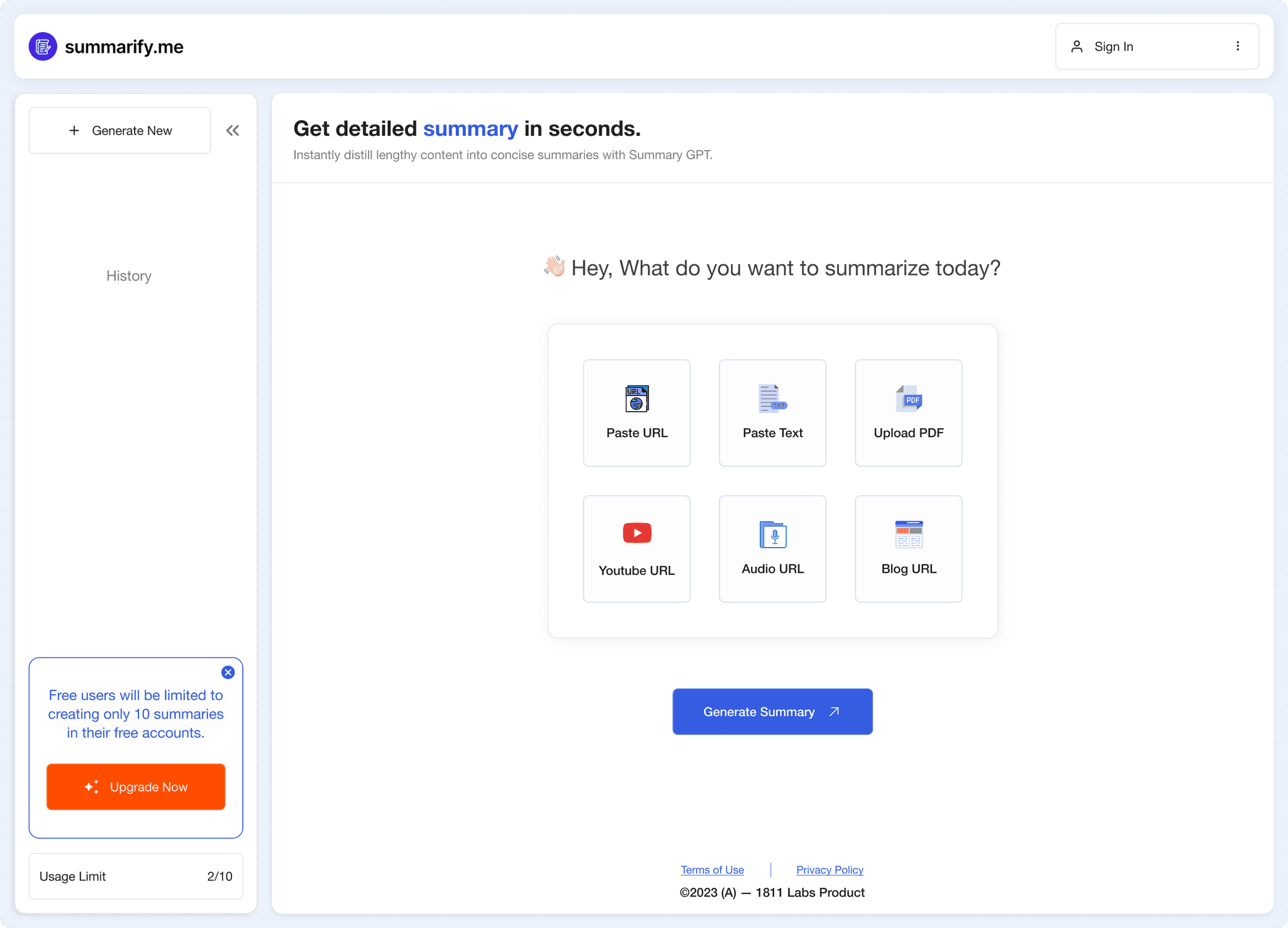
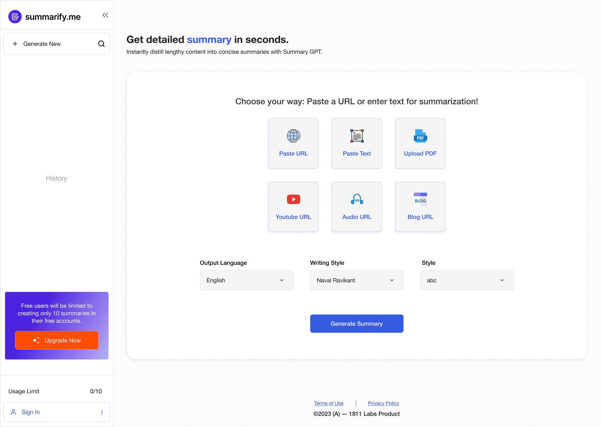
At the homepage, simplicity and clarity were my main objectives. I wanted to provide users with a clean and straightforward entry point. Initially, the design featured two input options: text and PDF. However, understanding the evolving needs of users, we expanded the inputs to include audio, YouTube, and documents. This flexibility aligns with the adaptability, acknowledging that user needs may change over time.
I used clear icons to represent each input type, and a side navbar ensures easy navigation and quick access to user assistance.
UPloading screen
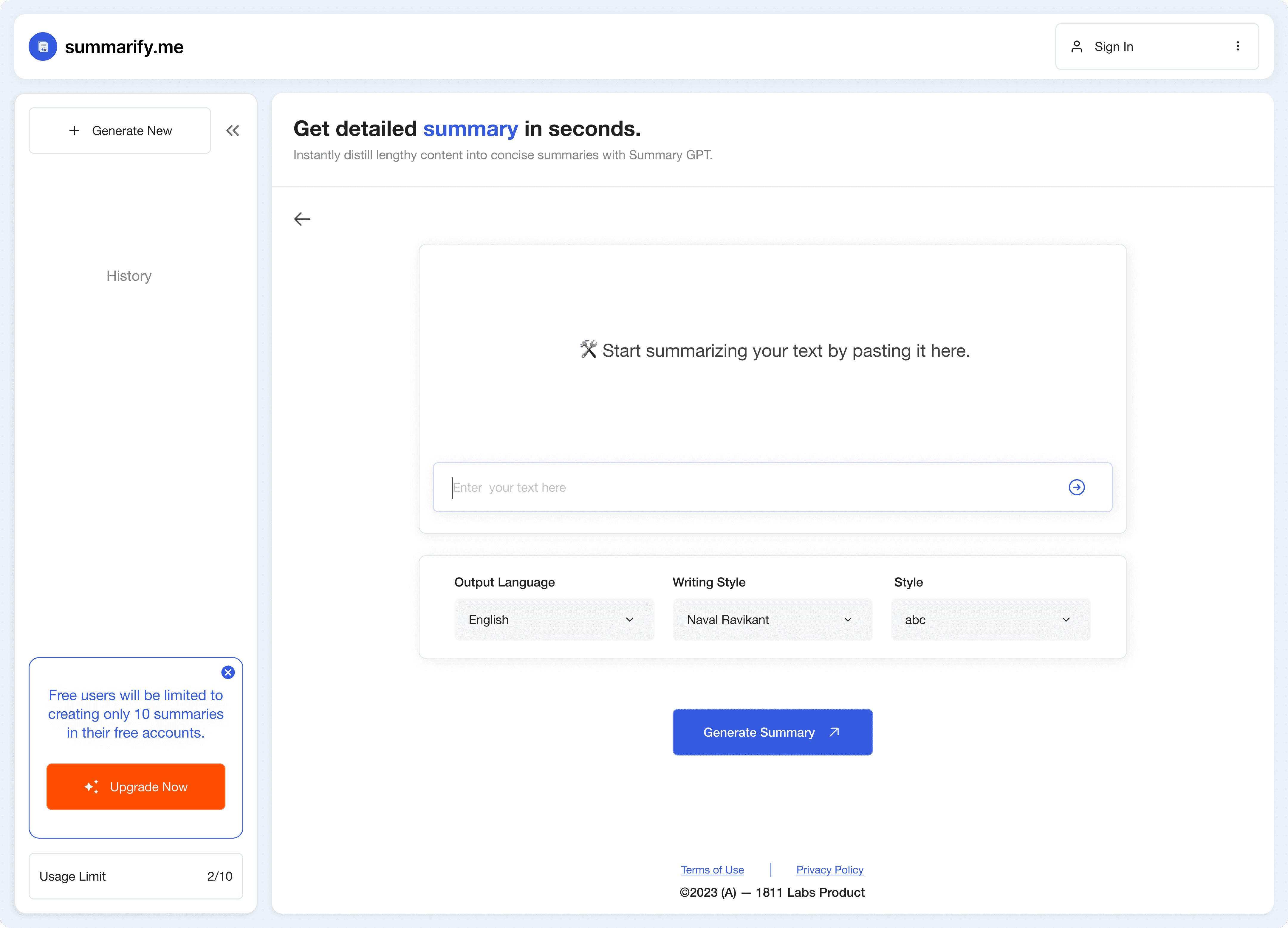
The upload screen is a key moment for user control.The user interface also allowed attribute selection post-upload, adding a layer of personalization around tone, writing style and language output. I focused on making it user-friendly by refining button visuals and allowing attribute selection easy with drop-down after upload. For varied input methods, like uploading a PDF, a small info modal confirms the file addition, keeping the design cohesive and straightforward.
Processing screen
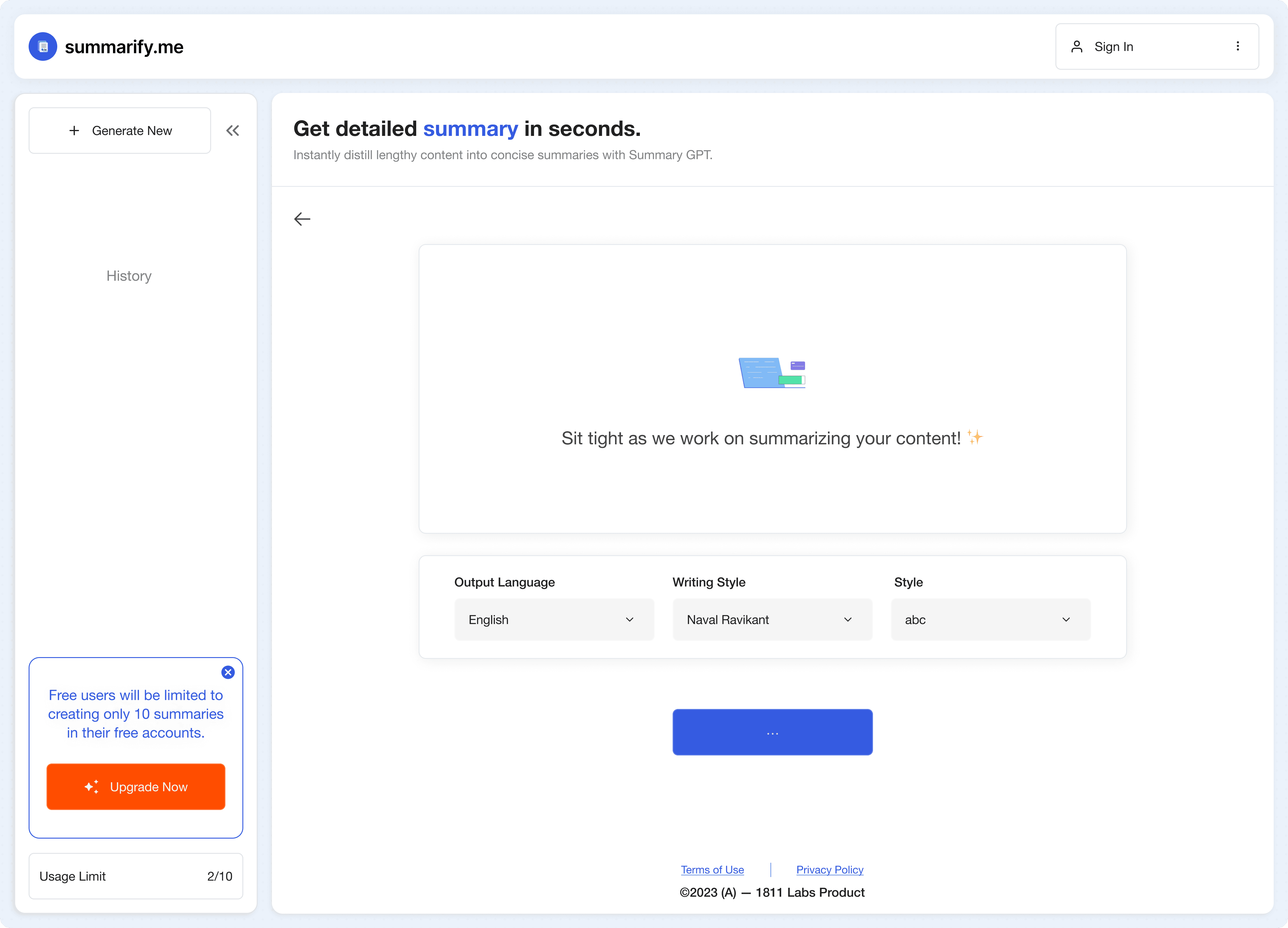
During the processing screen, transparency and engagement were my design focus. A dynamic animation and intuitively communicated progress to users were a priority. Real-time write-ups provide insights into the summarization process, helping users see the progress while they wait.
Summary screen
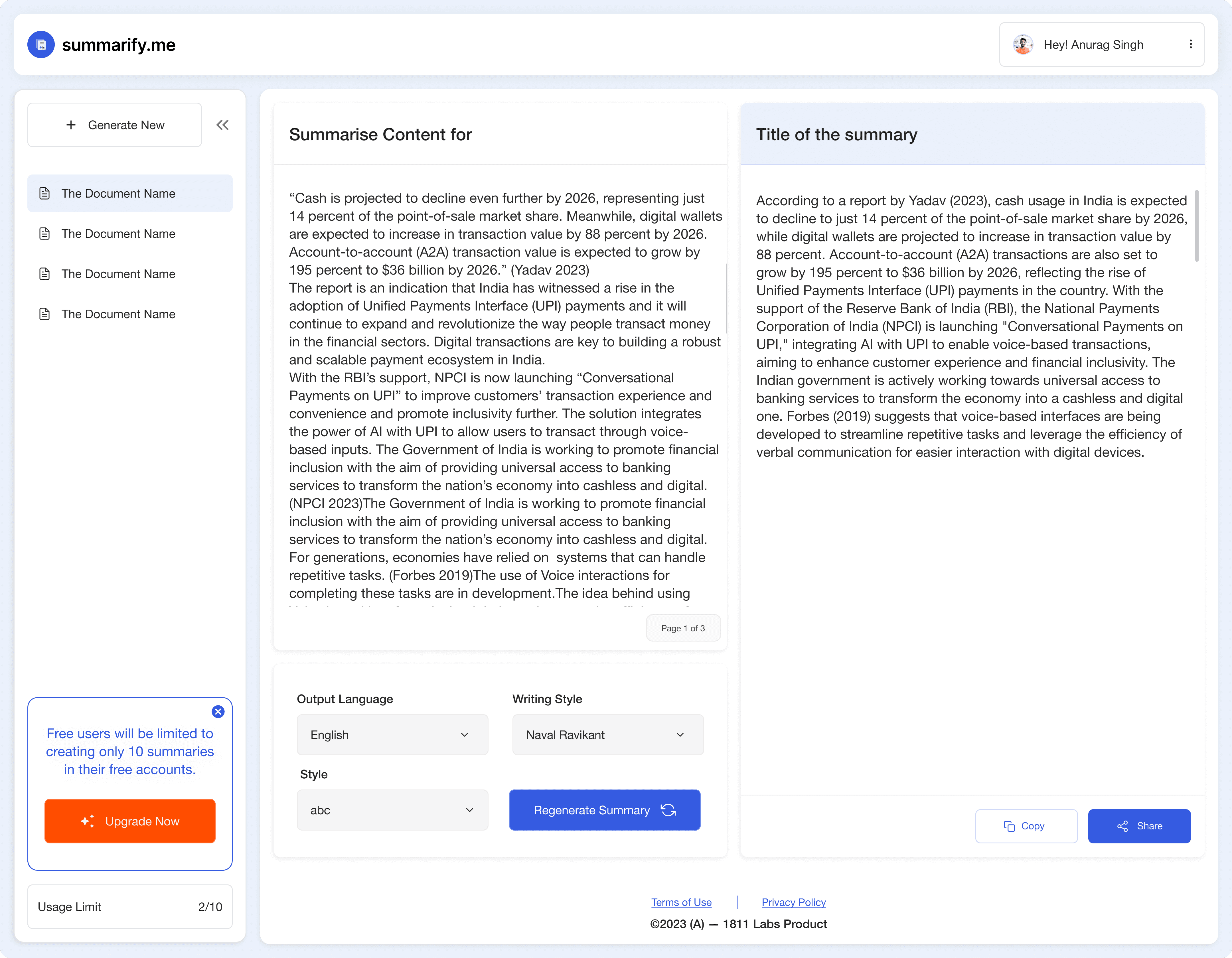
In the summarization screen, I adopted a modular structure to organize information logically. Breaking down the screen into distinct modules, one for the original content and another for the generated summary. Attribute modal played a crucial role, allowing users to regenerate the summary and providing an additional layer of interaction.I took bento layout approach for this screen.
SIGNUP screen
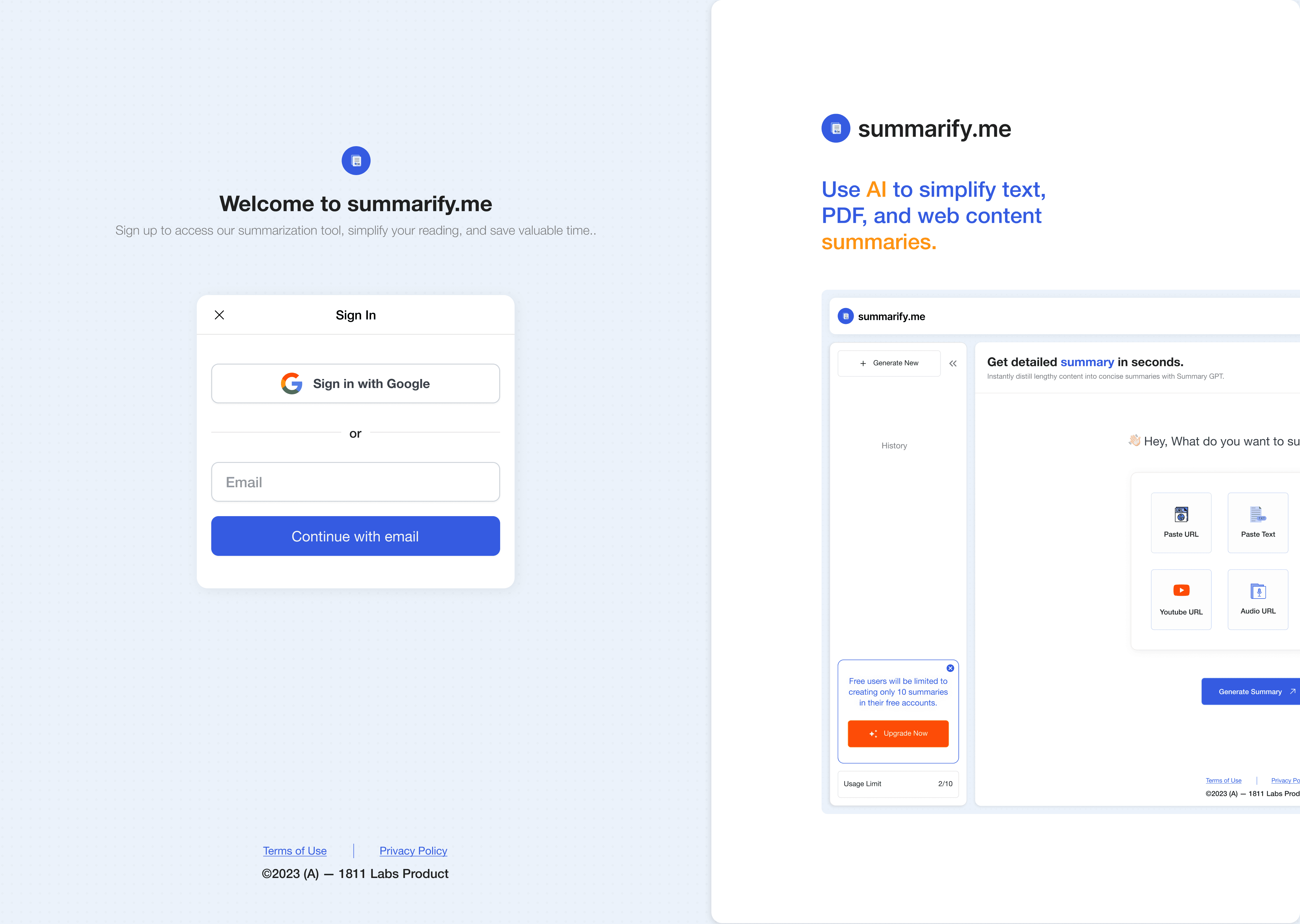
The signup screen is designed to be simple and easy to use. I have integrated Single Sign-On (SSO), which makes the process even more streamlined, as it only requires an email address. This decision was made to ensure efficient email registration for our potential users.
VISUAL components
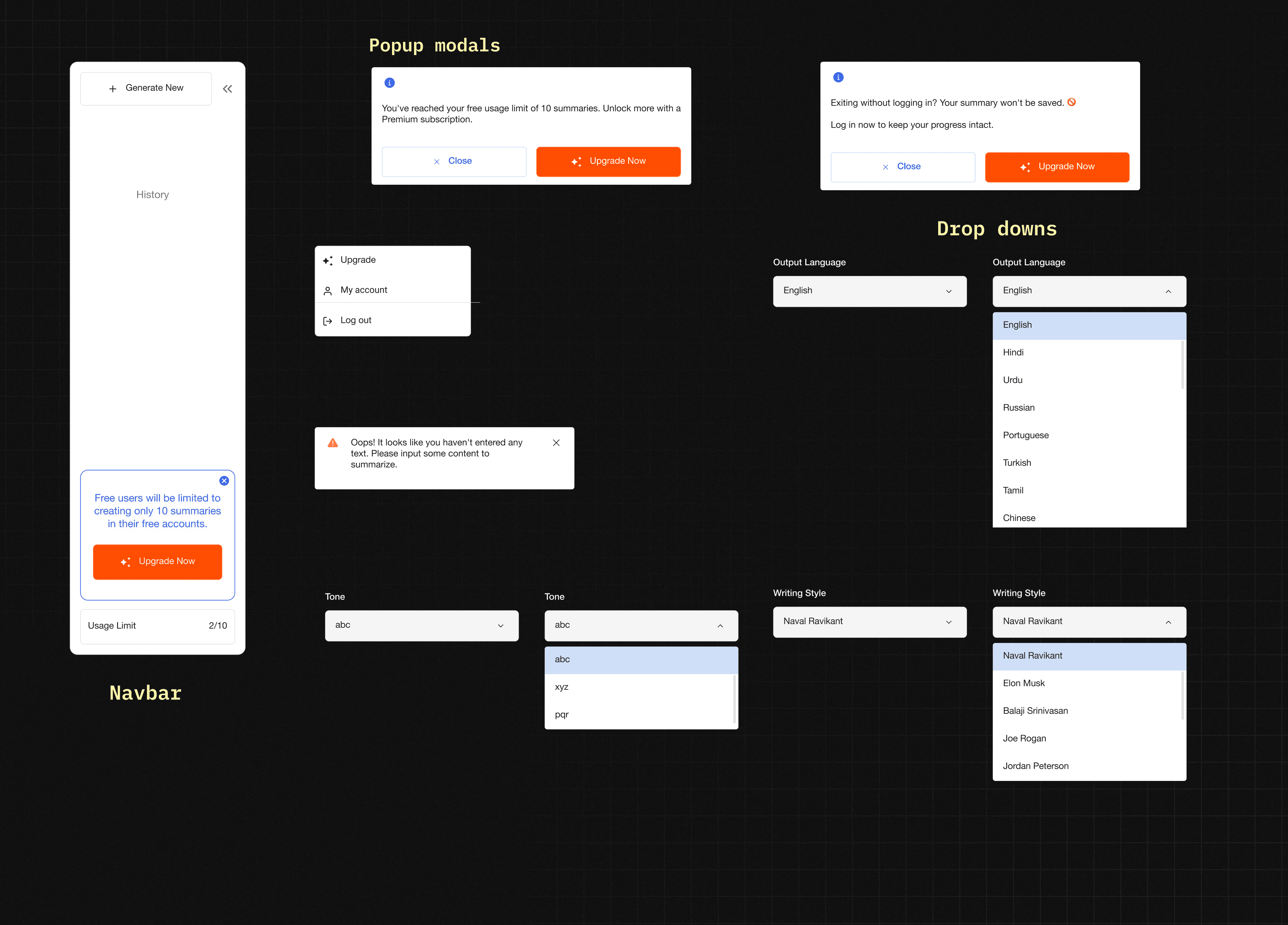
Small components like modals and dropdowns are strategically crafted for universal use across the website.
phone screen mockups
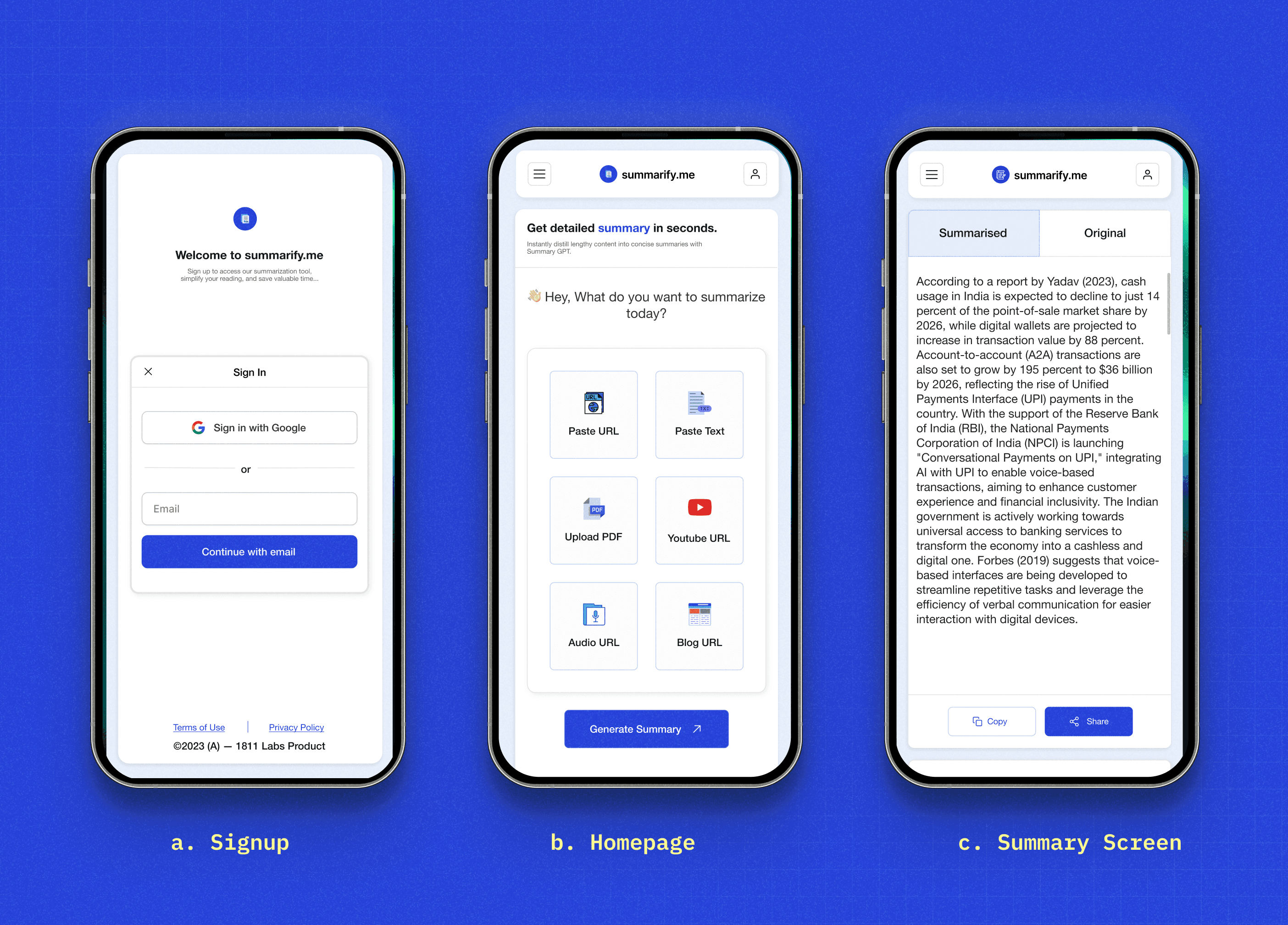
The design smoothly adapts to smaller screens, keeping both functionality and aesthetics intact. Small tweaks are made to fit within limited space, making buttons easier to use with touch and giving priority to important elements.

Homepage
At the homepage, simplicity and clarity were my main objectives. I wanted to provide users with a clean and straightforward entry point. Initially, the design featured two input options: text and PDF. However, understanding the evolving needs of users, we expanded the inputs to include audio, YouTube, and documents. This flexibility aligns with the adaptability, acknowledging that user needs may change over time.
I used clear icons to represent each input type, and a side navbar ensures easy navigation and quick access to user assistance.
UPloading screen
The upload screen is a key moment for user control.The user interface also allowed attribute selection post-upload, adding a layer of personalization around tone, writing style and language output. I focused on making it user-friendly by refining button visuals and allowing attribute selection easy with drop-down after upload. For varied input methods, like uploading a PDF, a small info modal confirms the file addition, keeping the design cohesive and straightforward.
Processing screen
During the processing screen, transparency and engagement were my design focus. A dynamic animation and intuitively communicated progress to users were a priority. Real-time write-ups provide insights into the summarization process, helping users see the progress while they wait.
Summary screen
In the summarization screen, I adopted a modular structure to organize information logically. Breaking down the screen into distinct modules, one for the original content and another for the generated summary. Attribute modal played a crucial role, allowing users to regenerate the summary and providing an additional layer of interaction.I took bento layout approach for this screen.
SIGNUP screen
The signup screen is designed to be simple and easy to use. I have integrated Single Sign-On (SSO), which makes the process even more streamlined, as it only requires an email address. This decision was made to ensure efficient email registration for our potential users.
phone screen mockups
The design smoothly adapts to smaller screens, keeping both functionality and aesthetics intact. Small tweaks are made to fit within limited space, making buttons easier to use with touch and giving priority to important elements.
VISUAL components
Small components like modals and dropdowns are strategically crafted for universal use across the website.

prototyping
Made a quick prototype our user flow.


Outcomes
Outcomes
Learnings and Future scope
Learnings and Future scope
Collaborating with Developer
Working with the developer is like learning new things every day—sometimes smooth, sometimes confusing. But guess what? Clear documentation is important—it keeps everyone on the same page. From walking him through designs to proper handoff, I learned a lot.
Feedback Sessions
Being the designer means embracing feedback from all sides. Every bit of input, whether from users or my team, was gold. It reminds me that the best designs come from a collective effort, and we did take a lot of ideas to make it.
Prioritizing Users over Stakeholders
Sometimes, user needs don't align with the grand plans. Striking a balance ensures we keep our users happy. Taking design decisions is tough.
Harnessing the Power of Design Thinking
Design thinking isn't just fancy words—it's our secret sauce we use everywhere in my college too. Understanding users, refining designs, and empathizing with them is like having a superpower. It's how we create irresistible experiences for our users.
Future Work
Introducing Subscription Plans
Looking ahead, the introduction of subscription plans for unlimited access marks a significant milestone. We aim to seamlessly incorporate this feature into the website, providing users with enhanced value and a broader range of Summarify functionalities.
Design Changes Based on User Testing
User testing of the initial launch has provided crucial insights. As we move forward, these insights will be instrumental in refining and enhancing the design. Iterative improvements will be made based on user feedback, ensuring an ever-evolving and optimized user experience.

©2023 (A.S) — Back to Top


